
Social Media Guru Chris Brogan posted an article [here] about iEllie.com and what gives it a new media type touch.
I thought I’d take Chris’ site and break it down, maybe analyze why I think he did certain things (whether he did it intentionally or not is a different matter).
I could go into colors, styles, fonts etc and psychoanalyze the whole thing but there’s no need to right now.
Let’s start with the header
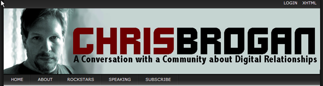
There is sometimes no better way to get your name out there or be recognized than registering it as a domain. By naming his site ChrisBrogan.com Chris has you immediately associating it with him As long as you know his name you know his web address.
It’s easy to remember and that is key.
The address (and his name as it happens) it at the top of the page and easily visible with a slogan or short description of what the site is about right underneath it where everyone can see.
Chris likes to put his picture everywhere he goes. Some would say he’s vain but it works for him because he goes to a lot of places to appear in person. Again, having a picture right there on the site lets you know what he looks like so you recognize him should you be lucky enough to meet him in person. There’ll be no confusion. At least one of you will know who the other is.
He’s not normally as stern and sullen as he looks in so many of is pictures though. Imagine him joking around and smiling lots.
The Menu Bar
Under the image header is the top menu, it only contains 5 buttons, it’s simple and to the point. Easy button succinctly describes what you’ll get should you click on it.
Above the fold
‘Above the fold’ is a term from the real media newspapers. Above the fold describes the first things a reader sees as the pick up the newspaper before dealing with the craziness that is trying to successfully open one.
Items above the fold get the most attention and often help to sell the paper, it is where the title is, where the front page headline is, the star picture, what is in the paper and more.
The same goes for web sites, however above the fold on a web site is the first screen a viewer/reader sees when they visit and before they scroll down the page.
In both it’s where your reader decides whether the site is worth spending any more time on.
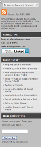 The Left Panel (above the fold)
The search box is important on blogs. If your reader is looking for something specific they don’t want to search for the search box to find what they’re looking for. Put is somewhere your readers can see it.
RSS/Subscribe should be above the fold because you want to promote people subscribing to your blog and you want to make this easy to find also.
Subscribers are like members to your blog, they’re like almost guaranteed readers.
Chris has a blurb about him and what he does so what you know for sure. This tells you a little more about what the site is all about too.
Chris is a rare sort (that’s for sure) he likes to put his phone number right out there. He claims he doesn’t get any crazies calling him at all hours – I wouldn’t risk it, knowing my luck my phone would be ringing off the hook.
Chris has his contact information right there on the initial screen so that you can see it and use it should you need it. He breaks down and spells out his email address because spammers like to scan sites and grab typically formatted email addresses. This way makes it harder for spammers to know it’s an email address.
It’s good to have your recent headlines on your site – not everything fits on your first page and readers sometimes like to scan through your headlines to see if there’s anything that catches their eye rather than reading through tons of articles and pages to find something they want to read.
Flexibility and various options of reaching your readers is good.
Chris uses the FeedBurner email subscription service to reach his readers on a daily basis by emailing headlines to them directly.
Remember, not everyone uses an RSS reader and not everyone checks your site daily. Reach your readers any way you can.
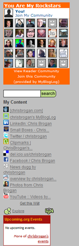
Left Panel (below the fold)
Chris uses the MyBlogLog widget to display who reads his blog. This is a good way of being a community, seeing who else is reading what you’rer reading, promoting others’ blogs and finding new bloggers and blogs to read.
There is another search here, Chris uses the Lijit search tool to search through not only his blog but the other social media arenas that he is a part of too.
Lijit is handy because you can see where Chris posts and what networks he is a part of, where he frequents and is a member of.
The Lijit search looks trough all this content and delivers results without your reader having to leave your site.
Lower down the panel is Chris’ Upcoming.org box – so you know what events he’ll be attending, making it easier to stalk him :-p.
Not only does this promote Chris but it promotes the events he’ll be at.
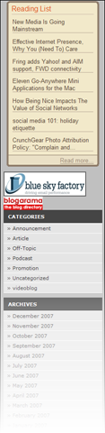 Chris uses a Google Reader widget to show you what he has been reading, showing you what he’s interested in, what matters to him and what he’s catching up on.
This tells you a little about him and promotes others too.
Of course it wouldn’t be a pro-blog without a little advertising. Chris has slipped a couple of buttons in here for Blue Sky Factory and Blogarama.
Normally ads are put towards the top of the page so they can be seen, this kind of advertising evidently doesn’t really concern Chris all that much.
Chris doesn’t use many categories on his blog – he has given everything he writes very broad definitions.
Of course the archives are there to show you that Chris has been around a while – they date back to March of 2004 proving that he’s not some fly-by-night blogger. Of course readers can click the different months to see what mattered to Chris in a given month, this is a good way to look at trends too, seeing what happened online and in the Social Media Community at a given point in time.
Of course we can’t forget the main content on ChrisBrogan.com. A large area is left to display the posts, after all – that is what the blog is about, right?
Posting dates and titles are easy to spot and read.
![]()
At the bottom of each post is a spot where the reader can add the post to their favorite social networking sites.
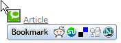
This is good because not only can readers find what they were looking at and share the posts but it promotes Chris’ blog across the blogosphere. Chris doesn’t have to lift a finger in this kind of promotion – his readers take care of it all for him.
I know I could have gone more into a lot more – what do you think? what would you add?